Paper technology.
I'm not talking about origami or Pepakura; I'm talking about looking at all the advances that paper, printers, and publication software have afforded us. Today I encourage you to rethink what you print, how you print it, and what you print it on.
And a preemptive apology - this blog is not going to be short. This entry has taken many hours of work (both from a content and photo perspective), but hopefully the potency of paper technology can be clearly articulated today. To get you jazzed about reading all my thoughts about paper, check out these collector cards the FIRST Robotics team I advised made:
 |
| Collect them all! |
Paper Types
Printing out on transparencies is a great way to add interactive elements to a document. Most biology books have a drawing of the human body on printed paper with "layers" of clear film that can be put on top (one showing the circulatory system, one showing the respiratory system, one showing the nervous system). Sure, that can be created with some patience. But that concept can be applied to other venues as well. Print out an essay on white paper. The first overlay could be a "red pen" that focuses on punctuation. The next overlay could be one that pointed out grammar. Different boundary maps in a history class could demonstrate conflicts over time. Transformational Geometry could be demonstrated with multiple overlays. In these scenarios, the students can be in control of each of the overlays that pertain to their learning.
Cardstock is very cheap and provides structure to printouts. As a math teacher, I used a lot of foldables (printed out on cardstock with "some assembly required" by the students) for different learning aids. It runs through most printers and is durable. Check out these foldables:
A few years ago, a colleague of mine designed a castle in Microsoft Publisher. It was a mixture of rectangles, circles, triangles and other shapes printed on cardstock. The students had to cut them out, measure the dimensions and compute the surface area. Then, they would assemble the shapes into three dimensional shapes. Measuring those, they could compute the surface volume of the castle. It was pretty incredible. Now with Pepakura, teachers can easily print complex three dimensional shapes onto cardstock (see my Iron Man post).
One way to really capitalize on eye-popping publications is to use color printers to print on sticker paper. You can buy actual sticker paper (which is pretty expensive), or you can print on Avery full-sheet mailing labels (less expensive and can be run through any printer). All you need is a cheap guillotine paper cutter (less than $20), and you can have some awesome stickers. In the picture below, all the stickers were printed on the Avery sticker sheets using a Xerox Phaser 8000 printer; it prints using wax instead of ink, so the end product has more structure and - if there is no white showing - can weather the elements more. But more on printers later in this blog.
 |
| Stickers are great for sticker albums and propaganda. |
Don't forget the power of colored paper. Don't be cavalier with your paper color selection; save it for important occasions. Like documents that are critical to the survival of students in your class. Some teachers might elect to color code every unit or chapter. That works too, if you can swing that (your institution might not have limitless supplies of colored paper).
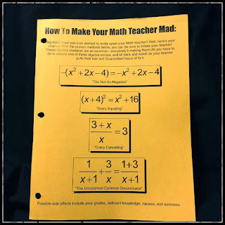 |
| In my class, OSHA Yellow paper is for the most important documents. |
It's also really neat to print on sticker paper, and then stick the publication to sheet magnets (usually very cheap). Great for marketing (make small business card sized magnets) and getting your vehicle into reserved parking at athletic events. For car magnets, get clear "self-adhesive laminating sheets" to put over the magnet to provide protection against road debris. Most magnet sheets come in large sizes, so it is easy to make oversized car magnets by printing out a few different stickers and sticking them to one magnetic sheet.
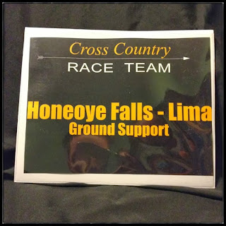 |
| Everyone thinks cars with magnets are official. |
At some point after my first year of teaching ended and my second year started, I lost some items or furniture from my room. I don't think it was malicious, I think that when the floors are redone and all the furniture is brought outside the classroom, some things get lost in the process. The next summer, I was prepared. I bought mail labels from Avery (no, I don't receive any sponsorship from Avery - I just think they make great products) and printed my name, classroom number and building on them. It helped a lot, and I noticed other teachers doing the same thing the following year.
 |
| Almost as effective as a guard dog, and requires less food. |
Size Matters
Paper types aside, it is easy to forget about other, standard sizes. Most copiers will print on 8.5 x 14 as well as 11 x 17. These papers can yield some really neat products. Booklets are traditionally printed on 8.5 x 11, with one staple in the corner. I think that printing out on 11 x 17 with staples on the spine give a much more professional feel. Many copiers will accept a stack of 8.5 x 11 paper as input, and can be configured at a "booklet" that prints on 11 x 17. This magazine product is really neat.
- It's professional looking
- If you print out an entire unit at once in this booklet form, students don't have to keep track of all the handouts - it is aggregated in this one publication
- Believe it or not, 11 x 17 is actually a bit cheaper than 8.5 x 11
When I used to teach Geometry, I would print out each unit in this "mathzine" (clever name, I know). By the final exam, each student would only have to wrangle the 12 booklets (as opposed to the hundreds of papers they otherwise would have had). The other byproduct of the booklet is that there is no ambiguity as to what needs to be brought to class every day - just bring the mathzine.
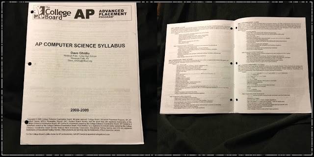 |
| It's the latest edition of Nerd Quarterly! |
 |
| Programs! Get your programs here! |
 |
| Mathzines are great for birthday parties, car rides, and the beach. |
And size really does matter with paper. I think 8.5 x 14 gets a bad rap. Most people don't see the beauty in it - all they see is paper that doesn't fit well in a folder. But 8.5 x 14 is really neat when folded in half. Many copiers will accept a stack of 8.5 x 11 and output, in booklet form, on 8.5 x 14. The effect is really neat - a "mini-booklet". These are great as supplements. For instance as a vocabulary book for the entire year. Imagine being able to have every word that is a critical part of the class, listed alphabetically with 2 or 3 blank likes for the student to fill in (you could even insert the unit the word first appears in, or what page they got the definition from). Or a mini-booklet that hosts all formulas for the year. They can still be hole punched (only two holes, but that's enough to secure them in a 3 ring binder).
This example is a portable version of medical information for all the athletes on the Track and Field team I coached (we need this information on us at all times). I juxtaposed the 8.5 x 17 booklet for comparison.
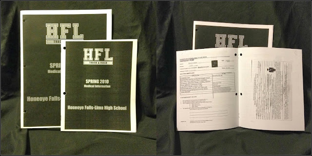 |
| Mini booklets are great when you're in the field. |
In addition to being rock-solid machines, they print very fast, smell awesome (like opening a brand new box of Crayola crayons), and have beautiful resolution. Because the ink is wax, the paper gains structure. And (as mentioned before) any document that is all color (no white in the entire document) will have a surface that provides a bit more protection.
The following samples have been printed on a Xerox Phaser 8560 DN. The "DN" means the printer has the capability to print double sided. Although I printed on regular copy paper the majority of the time, card stock does not play well with double sided printers. Typically, I would print out all my copies of the first page, and then run those papers through again (flipped over) so that the second page would print properly.
 |
| The Phaser can print out subtle backgrounds (document made with Microsoft Publisher - see below). |
 |
| Google Maps + Microsoft Publisher + Xerox Phaser = weather resistant course maps for your next Cross Country meet. |
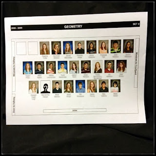 |
| Tap into your student information system (SIS) to grab ID photos and make a visual seating chart. Great for substitute teachers. |
 |
| IntoCartoon + Microsoft Publisher + Xerox Phaser + DARE Drunk Driving Simulation = a cautionary tale. |
 |
| Just a plain ole' document (printed on a Phaser). |
Before we move on to the next section, also be aware of the capabilities of the copier at your school. It very well might be the case that the copier can handle 11 x 17 and 8.5 x 14. Also, be sure to squeeze every drop of usability out of the copier by using the hole punch feature and the staple feature (don't forget that some copiers can put multiple staples along the edge of a bundle of papers, too).
Lastly, some schools have large format printers. They might be in the Technology (Project Lead the Way) rooms, a media lab, an Art room, or even the IT department. Find out if you can use those for special occasions.
Yes, getting the hang of it take some time.
Yes, it can be frustrating.
No, you shouldn't really use the templates that come with it; start from scratch.
Yes, I will be doing a series of tutorials in the next few weeks about it. Until then, you can view the training document I made. Keep it. Distribute it. And wait with bated breath until I do the YouTube tutorials. But trust me - Publisher is well worth it. I haven't used Microsoft Word to create documents for my classroom in years. The only downside is that Publisher is not available on SkyDrive yet. So I can't use my Chromebook to design (although Inkling Habitat seems like a promising cloud-based environment for desktop publishing).
Every document in this blog entry was created with Microsoft Publisher. So if you aren't convinced yet, check out some more things that can be created with Publisher. Note that Adobe InDesign is also a sweet tool for desktop publishing, although it is more sophisticated than most classroom publications need.
 |
| Create a sweet gossip rag to recap school events. |
 |
| Add a lanyard, and give your students sweet credentials. |
 |
| Handwritten binder labels are for suckers. |
 |
| Nailed it! Thumbnail logos made easy! |
 |
| Grab change from the lines at lunch and make iron-on designs look great. |
There is also the notion of a cold laminator. The less expensive machines are powered by a hand crank, but are perfectly viable for schools or home.
In either event, laminating provides protection and professionalism to documents.
 |
| Peter Parker never had one of these. |
 |
| Tools of the trade. |
A nice example of what a $1.00 hole punch can do to streamline grading:
 |
| Homemade Scantron. |
The last production tool I leave you with is a button maker. Real-deal button makers are pretty expensive. At least one hundred dollars, if you find a used one on eBay. Alternatively, if you don't need to make that many buttons, try out the Badge-A-Minit button maker. For about $30, you can start making buttons. If you really want volume, step up and buy a more robust device. But the Badge-a-Minit Hand Press works great for low volume runs.
Check out a nifty YouTube video showing how to make them:
So, that's about all for today. Before you go, I've included part of the marketing campaign I did for our Track and Field team. I designed them in Publisher and printed them on the Phaser. A lot of them. I put these up all over school. I mean, all over. It was neat because the students in the pictures were like celebrities, and it was impactful enough to get students to come out for Track in the Spring.
My closing comment is that it took me about 8 hours to construct this post (far more than any other blog entry to date), and the funny thing is that I just talked about paper. No complex hardware or a suave software tutorial. Hopefully you'll be able to take something away from this post, and if you have more to add, please leave a comment.
You could leave it in the comment section below, or you can write it on paper and send it to me.


0 comments :
Post a Comment